Adding a border around text in Photoshop is an easy and straightforward process that can give your text a professional, eye-catching look.
With the right technique, you can make any text stand out from the rest of your design and create a visual impact. In this guide, we will cover how to put a border around text in Photoshop with step-by-step instructions and how to customize the border for a unique look. With just a few clicks, you can make your text truly shine!
We hope that this guide will be useful for anyone looking to add a border around text in Photoshop. So let’s get started!
How to put a border around text in Photoshop
The border effect can be incredibly useful to give the text a more prominent, eye-catching look within the design. Fortunately, Photoshop makes it quite simple to add a border around text. There are many ways to put a border around text in Photoshop.
Using the stroke command:
One way is to use the Stroke command. With the Stroke command, you can create a border of any color, thickness, or style around your text.
To use the Stroke command, first select the text layer to that you want to add a border. Then, go to Edit > Stroke (or use the shortcut Command + Option + Shift + S). This will open the Stroke dialog box.
In the Stroke dialog box, you can choose the color, width, and style of your stroke. For example, you can choose a color from the Color Picker, or you can enter a hex code for a specific color. You can also choose how thick you want your stroke to be and whether you want it to be a solid line, dashed, or dotted.
Once you’ve chosen your settings, click OK to apply the stroke to your text.
Using the layer style:
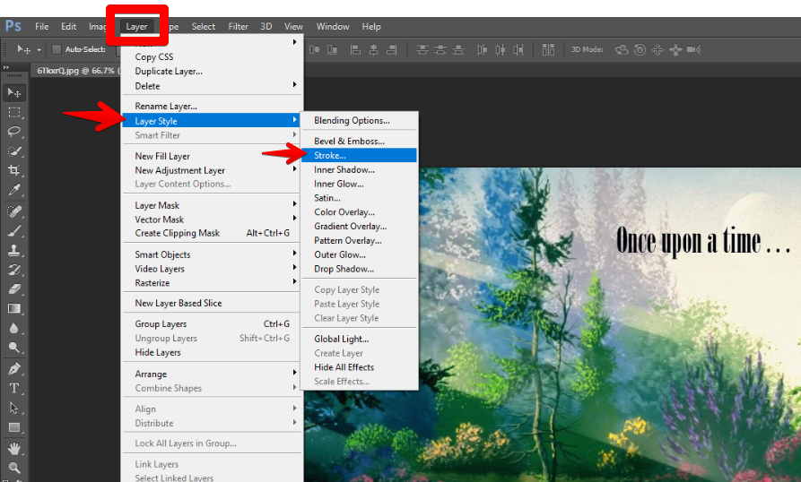
You can also add a border to text using the Layer Style dialog box. To do this, double-click on the text layer in the Layers panel to open the Layer Style dialog box.
To do so:
1. Create your text layer and type out your desired message.
2. Select the layer that contains your text.
3. Go to Layer > Layer Style and select Stroke.
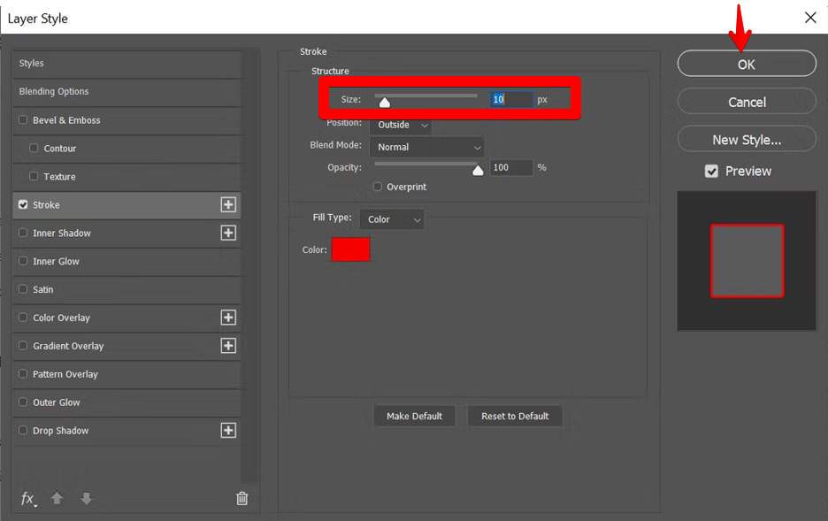
4. Click on the color swatch and choose an appropriate border color from the color palette.
5. Adjust the size of your text border by adjusting the “Size” setting within the Stroke menu.
6. Finally, click OK, and your text will have the desired text border effect.
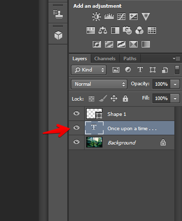
Here’s the final output when you put a border to a text:

The power of typography in graphic editing
You’re aware that it’s not as easy as pasting some text into an image to make a design. You’ll need tact and an appreciation for a form to succeed. Spending hours upon hours fiddling around with the typeface is a common practice among designers, whether they’re working on a landing page, book cover, or logo.
Is there a particular reason we spend so much effort perfecting our typography? Let’s go over the top eight, in no particular order, reasons why typography matters in graphic design.
One, it helps one become more well-known.
Your company’s image will benefit greatly from the consistent use of fonts and rhythmic presentation on your website. If you want your audience to remember you, make sure to use memorable fonts in your visuals.
The choice of typeface can both distinguish your business and serve as a means of identifying it to customers.
Each piece of content can more effectively represent your business thanks to the typography you choose.
To convey a message
In other words, graphic design revolves around getting your message across visually. Improve the readability and clarity of a design’s message through the careful application of typography. Even in an image-heavy design, the typeface must be bold enough to stand out. When working with a lot of text, it’s important to use typographic design to highlight specific parts of the layout and draw attention to crucial points. For the main message to be easily understood and conveyed, there must be a deliberate and cohesive balance between various competing elements.
It communicates an emotional state.
One example of content is a commercial for a digital game. This document could include some of the game’s most interesting content. Content in this case should be designed to be lighthearted, flirtatious, and glamorous. A serious tone can be achieved by employing clean, straightforward, and professional-looking fonts. The typeface used affects how the text is read.
It promotes harmony between the layers in your design.
The presentation will flow more smoothly if you design a typography and use the same pattern throughout. In typography, harmony is the primary focus.
Your website will have a more artistic feel with a harmonic design. Consistency is achieved by using the same font for related material. Aligning fonts in the right proportions keeps your presentation neat and tidy.
It creates a sense of professionalism.
Professionalism is showcased to its fullest when typography is used effectively in a design project. Customers’ confidence is earned through the use of suitable text font and size. If your site is commercial in nature, this will help promote your product.
Typography is fundamental to the design process taken by professionals. Your font choice defines the value of the content you provide and ensures your customers’ trust in the knowledge they gain.
Conclusion
Using the methods detailed above, you can quickly and easily add borders to text in Photoshop. With a few simple steps and some creative exploration of colors and sizes, you can give the text an exciting new look!
Remember to save your work regularly and experiment with text borders often. You may surprise yourself with the level of creativity you can reach! Happy editing!